Light is Art | Salem, MA | October 1, 2010

The Peabody Essex Museum (PEM) has launched FreePort, its newest contemporary art initiative, with a commission by internationally renowned artist Charles Sandison.

Figurehead, which opened 2 October 2010, activates handwritten words from 18th-century ship logs and journals, creating an immersive environment of swirling, luminous language. Inspired by PEM's 18th-century origins in global trade, Sandison gives poetic visual form to the thoughts and aspirations of America's first global entrepreneurs in East India Marine Hall. The elegant neoclassical room — PEM's original display hall — features immense sculptures from the prows of vessels that once set sail from Salem harbor.

Working at the intersection of visual art and computer programming, he uses his own customized software to map trajectories around the room; the projected images respond to algorithms that guide their behavior. In Figurehead, Sandison's algorithms draw on real-time weather data from the internet, making the installation organic and ever-evolving.

Here's a rather bad mobile phone video I shot at the opening event. It's of pretty bad quality, but you can get an idea for how immersive the installation is.

Organized by PEM's curator of contemporary art, Trevor Smith, the installation is the first in a series of projects inviting artists to establish a unique dialogue with the museum and its visitors. "Each year, we'll work with artists and our audience to explore the effects of global give-and-take on our culture," says Smith. "For over 200 years," Smith says, "PEM has been tracing the ways in which trade, exchange and translation drive cultural change. This is something unique to our museum. These are also the questions that contemporary art explores."

At the Arabia Steamboat Museum, the "felt message" is precious cargo | Kansas City | February 2010

In an oftentimes heady profession such as exhibition design, it’s easy to over-think the idea of the coveted “take-home message.” We interpretive developers identify, write, and hone big idea statements, core themes and primary messages all the time, and hope that visitors will stop and read the graphic panels upon which these messages often blatantly reside. And we hope they will take these messages home as insight and education.

I suspect, however, that most take-home messages are gathered viscerally – felt rather than read. A recent visit to the Arabia Steamboat Museum in Kansas City reminded me of this in a powerful way.

The Arabia Steamboat Museum is home to a true time capsule of frontier life in America in the 1800s. The Arabia was headed up the Missouri River in the fall of 1856 when she struck a tree snag and sank just north of Kansas City. Her cargo hold was full of 200 tons of supplies bound for general stores and pioneer settlements. As the years passed, the river changed course and left the Arabia buried beneath the mud of a Kansas cornfield. Finally, in 1988 a group of modern-day adventurers uncovered the lost Arabia and her magnificent cargo.

The presentation of Arabia's artifacts is, for the most part, not noteworthy. Simple, “storefront” displays of dishes, tools, bottled foodstuffs, clothing and personal items recall the familiar experience of window-shopping at a Crate and Barrel or an Old Navy (or, in this case: Really Old Brown).

What IS extraordinary and memorable, is the omnipresent take-home message that was best articulated by my tour guide. She said, “We wanted to show visitors how much stuff a 170-foot steamboat could carry. It’s that simple.” I immediately thought “...of course!,” for they nailed it in the design of the experience.

I also thought how tempted many designers would be to bring context murals, layered story panels, and object interrogation technologies to the interpretive palette. But here, less was truly more. With its one-of-a-kind story, close encounters with authentic evidence of history, and a mix of emotional, historic and technical interpretation (mostly delivered live), the Arabia Steamboat Museum offered everything I seek in a museum.

And its felt message shined though a lack of mud.

Aquarium Design: Top 10 Trends

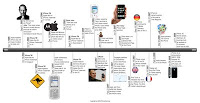
Recent visits and collaborations with public aquariums and their designers, have revealed the following trends in design and interpretation for live animal exhibitions:

1. Interpretation includes stories about individual animals.
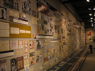
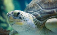
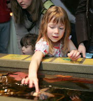
To engage the mind with scientific interpretation is perhaps not enough anymore; people like to have their heartstrings tugged. At the John G. Shedd Aquarium (Chicago), visitors learn of Bubba, the grouper who's grappling with cancer; and Nickel, the sea turtle who swallowed a 5¢ coin that lodged in his throat (photo). Bubba's message: The aquarium went to great lengths to partner with the local hospital to take really good care of me. Nickel's message: animals need safe homes too – and the way that humans use (or abuse) the natural environment has effects.

2. A visit is more than just animal exhibits.
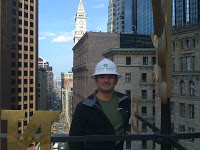
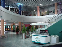
Spectacular animal collections and beautiful exhibitions will not compensate for inadequate amenities. Inconvenient parking, a lackluster arrival experience (photo), and lousy food service and gift shops will eclipse the reason why visitors think they came in the first place: to see the animals. Many of the Las Vegas aquariums (like that at the Mirage) have done well to incorporate views into animal habitats while visitors are being ticketed, while they are dining, and while they are shopping. These kinds of incidental encounters with the animals ensure that good impressions and a sense of value are being made across the structure of the visit.

3. Size matters.
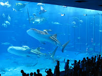
BIG is memorable. Most of the Japanese aquariums and the new "world class" aquariums in the US are featuring numbers in the 6 million gallons-per-tank range. Acrylic configurations are interesting and immersive, designed to heighten the thrill factor and maximize viewing. We're seeing a trend toward wider and shallower big views in order to surround visitors in the immensity of ocean environments.

4. Offer a One-and-Only.
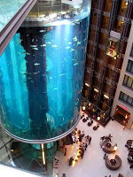
At the Radisson Blu Hotel in Berlin, the precariously perched AquaDom tank, located in the lobby, features an elevator ride through the middle of the cylindrical aquarium (photo). You can do this only in Berlin.
The Nagoya Public Aquarium is the only place where you can visit at night and witness captive sea turtles laying their eggs on replicated beaches.
In Sydney, Australia, you may see rare, Southern Ocean dugongs.
More and more, aquarium designers are being driven by the criteria to create a one-and-only attraction. In the future, we'll see more large-scale habitats, more motion, more interesting husbandry protocol, more conservation practices (like breeding/re-introduction programs) on view, and more charismatic animals like manta rays, giant sharks, and huge schools of pelagic fish.

5. You can be linear and free-flowing.
People appreciate a sense of cognitive organization but they tend to move through physical space in random patterns – like serial clicking on the internet. Linear exhibits with narrative interpretation are becoming shorter to coincide with visitors' dwindling attention spans, and many aquariums now offer several thematically-structured exhibits (rather than an overarching narrative) to facilitate choice. At the Georgia Aquarium, visitors depart from a central hub and journey through any of five divers' experiences in a classic hub-and-spoke arrangement that is basically a "shopping mall" of experiences. I suspect that the public consensus would jive with my own: I felt in control and empowered to make selections, I felt fine about splitting up and regrouping with my party, and I even re-visited favorite attractions all within the frame of a single visit.

6. Offer kid-friendly exhibit experiences.
With families being most aquariums' key audience, they must offer something for young, energetic visitors. Kids need things to touch, and safe places to run, jump and play


7. Perhaps water and technology do not mix.
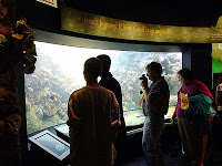
Viewing animals IS interactive – and if it isn't broke, don't fix it. Computer-based technology in front of tank windows is a bad idea. Consultation with several institutions suggests that their visitors actually came to get away from computers and simulated experiences. According to Mike Delfini, Director of Design at the Shedd Aquarium, their electronic animal ID systems (photo) have met with visitors' approval, however their other technological offerings are not so popular.

8. People come to see the animals – end of story.
"Learning Galleries" with little or no animals: bad idea. "Conservation Labs" with preachy messages and few living animals: bad idea. When it comes to education, people do enjoy demonstrations, guided programs, and privileged tours of the back-of-the-house like those offered by the Georgia Aquarium. Here, live animals and human/animal interactions are featured and appreciated.

9. Punctuate the self-guided visit with guided events.
From behavioral demonstrations with marine mammals to smaller-scale trained fish shows and timed feeding programs, people love to gain access to the world of the trainers and animal keepers. The Shedd is delighting its guests in smaller venues (40 people at a time) with programs such as Trainer for a Day, and special animal encounters.

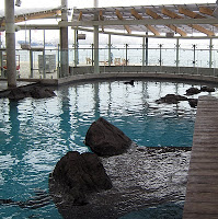
10. Offer indoor and outdoor experiences in order to provide a sense of place and a change of pace.
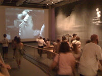
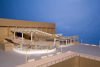
Outdoor venues can host large and unique experiences and strengthen an institution's connection to its city or setting. The Puerto Rico Aquarium features 40,000 square feet of exhibits under usually sunny skies, and Orlando's Discovery Cove has the feel of a tropical inlet. Fee-flight aviaries serve to remove the perception of barriers. In my own city of Boston, the New England Aquarium's new marine mammal facility (photos) features wonderful views of Boston Harbor and above- and below-water views of..... California sea lions?

Number 11 bonus trend: Be local and exotic.
California sea lions in Boston? Aquariums and zoos are strengthening their interpretation of local and regional ecology in an effort to create relevancy for local visitors and align with state science curriculum standards for school kids. At the same time, they're offering enticingly exotic animals and habitats in an effort to lure thrill-seekers and prove themselves as world-class attractions.

On Timelines

This blog entry is a summary of an interview conducted by Pat Matson Knapp (PMK) of the Society for Environmental Graphic Design. Excerpts were published in the organization's magazine, segdDESIGN, issue 24, 2009.

MK/objectIDEA: Pat, here are some quick answers to your queries. Note that I’m first and foremost an exhibition planner, so these responses might be considered “What can the museum field teach us about timelines?”

PMK: What is the coolest/most effective timeline you've ever seen?

MK/objectIDEA: Honestly, they are few and far between. What comes to mind immediately is "The Crisis Hours" at the Sixth Floor Museum in Dallas, TX, located in the Texas School Book Depository: the site of Oswald's sniper perch. The timeline section of the museum examines the immediate aftermath of the assassination and the four-day period that culminated in John F. Kennedy's funeral and the murder of Oswald. I recall its effectiveness because of its compelling content, diversity of presentation (photos, objects, texts and an AV program), and above all: BREVITY. The chunks of time are tiny respective to other timelines I've seen. As a visitor, I could see the length of the timeline in one view and be comforted that my investment in the exhibit was only for a few minutes and didn't hinge solely on my reading lengthy texts. I lifted the following description from the museum's website. Notice the small bite-sized chunks of time:

Only 45 minutes after the shots rang out in Dealey Plaza, Dallas Police Officer J. D. Tippit was murdered in the Oak Cliff section of the city. Thirty-five minutes later, suspect Lee Harvey Oswald, a clerk at the Texas School Book Depository, was in police custody. Oswald was later charged with both murders. Less than 48 hours after the assassination, Oswald was murdered in the basement of Dallas Police Department headquarters by local nightclub operator Jack Ruby. Featured artifacts in this area include the handcuffs worn by Oswald during his attempted transfer from the city jail to the county jail. Along one wall, a detailed timeline explains the sequence of events as they unfolded in Dallas and in Washington, D.C. In a nearby theater, visitors may watch a 10-minute video featuring footage from the Kennedy funeral and scenes highlighting the global response to the assassination.

I recently had the great joy of working with the Nantucket Historical Association on the development of their new museum center. It's a trio of museums, actually—a whaling museum, historic candle manufactory, and changing temporary exhibition gallery. The museum center is unified with an “entrée” exhibition that features a timeline of island events that shaped the course of Nantucket history. I worked with the designers to ensure that the overhead band of dates and events was supported with rich displays of objects. The beginning of the timeline (shown here) features the earliest known human history of the


island and features a map of Nantucket with paleo-Indian objects placed upon it in the locations where they were uncovered by achaeologists. Visitors engage the display as a sequence of events; a chronological display of artifacts; and an orientation to the museum. I wouldn’t term it an all-inclusive timeline. It was very targeted at the island's defining moments.

PMK: What do the "bad/ineffective" timelines do wrong?

MK/objectIDEA: I have a few opinions about that:

A. The subject matter might not be solely linear (Information Breakdown). Surprisingly, designers sometimes try to force non-linear events into timeline formats. Case in point: In preparation for working with a large natural history museum, I recently surveyed exhibitions about the processes of evolution. I found that while scientists often express their interpretation of evolution visually, as an elaborately branching tree, many museums attempt to “tell the story” linearly as a sequence of events in a linear gallery. In cases like this (and I’d love to survey more) the dynamic nature of the subject is compromised by being forced into a timeline.

B. Many timelines have been created under the assumption that time is a valuable interpretive lens for a general audience. (Interpretive Breakdown). For example, you REALLY must love your iPhone to love the iPhone timeline no matter how beautiful its design might be. Museums often assume this level of interest and offer their guests deeply detailed timelines. Additionally, 2-dimensional timelines select their audiences rather stringently, I suspect. The ones containing objects are more compelling to me.

C. In an effort to be “rich” timelines become cluttered. (Design Breakdown). Case in point: filmmaker, Ken Burns created a timeline—The Civil War—presented through 11 hours of PBS airtime using images, music, maps, biographies, and historical documents. The film series is a rich document, and drew a wide and captivated audience. An example contrary to this is The Civil War in Four Minutes offered by the Abraham Lincoln Presidential Library in Springfield, IL. It’s also an audiovisual timeline. However, The Lincoln Library, in focusing on how the War played out on battlefield geography, used a single medium—a projected map—and the single interpretive lens—the landscape—to capture the library’s ambulating audience of tourist families and schoolchildren. Again, the provocative and informative title: The Civil War in Four Minutes signals the depth of the program and the time investment needed.

D. The designs of timelines do not often align with the intentions of their users. (Motivation Breakdown). In a museum setting, visitors come to be in a social place, to see the real evidences of history’s events, to be moved emotionally and intellectually, and to interact with objects and ideas. In a museum, visitors are in a “food-court” of experiences; continuously sensing the next offering and making choices for what to ingest. In this environment (akin to serial clicking on the Internet) timelines often unrealistically require their users to stop and pause for long periods of time and “grip the handrail” of a single experience.


Exhibit audiences demand interactivity and choice. This example: http://thewhalehunt.org/whalehunt.html is an on-line timeline that would be at home in any museum. It takes the idea of a timeline and gives the user the ability to throttle the speed and manipulate the presentation artfully and intellectually.

PMK: Why is it so difficult to do timelines well? What are the unique challenges of presenting events over time?

MK/objectIDEA: By “well” I’m assuming you mean beyond graphic design. I’ve seen many attempts at timelines (in museums) that look beautiful but do not function informatively. And the more I think about it, this might be OK in some circumstances. The timeline that serves to ground the exhibition, Mathematica (designed by Charles and Ray Eames), is so multilayered that for many, it becomes beautiful wallpaper.


To sum it up—why some timelines are ineffective— I think designers sometimes collapse the ideas of events over time, unfolding sequence of events, and storyline. When all of these get rolled into something called a timeline, the communication integrity breaks down and graphic design attempts to compensate. Designers of all disciplines should work HARD with curators, historians and exhibition developers to distinguish the communication aim of the display. Perhaps a timeline isn’t the right medium.

PMK: What are some of the basic do's and don'ts of timeline design?

MK/objectIDEA: Do’s: brevity, poignancy, interactivity, flexibility, and sensuality. Don’ts: Complexity, prolixity, monotony.

Coltsville Plan Delivered to State, National Park Service, and General Public | Hartord, CT | December 2008


On December 18, ObjectIDEA participated in the presentation of a completed Visitor Experience Plan for Coltsville National Historic Park. The plan, commissioned by the state of Connecticut, analyses the interpretive potential of the site, and offers a vision for the use of the remnant buildings that comprise the historic landscape of the Colt Firearms Manufactory known as Coltsville. The focus of the interpretive plan is on the processes pioneered by the Colt Company that honed the future of precision manufacturing in America, and the business ingenuity of Samuel and Elizabeth Colt in the realms of product promotion and international business.

The plan was presented from the lectern of the Church of the Good Shepherd, an 1869 High Victorian Gothic church, whose construction was commissioned by Mrs. Colt to serve the workers who resided in Coltsville.

CT Congressman John Larson opened and closed the presentation with inspirational remarks and enthusiastic endorsement. The presentation was broadcast on the state's public television channel.

Iconic Buildings Offer Historic Views | Boston & Hartford | October 2008

Two projects – one in Boston, the other in Hartford – have recently provided me with very privileged and historic views.

The Old State House and Boston Massacre Site, Boston
In June, 2008, objectIDEA participated in a study with the Boston Historical Society to evaluate the visitors' experience at Boston's Old State House. The study paved the way for an interpretive planning exercise wherein recommendations were made to restructure the circulation of the visitors' experience in the building, and focus the institution's single, emblematic communication aim: This building, once a monument to English rule, is now a monument to American resistance. 

As the interpretive plan took shape, so did the Old State House itself, as it was undergoing an extensive architectural restoration as well. Prior to the re-gilding of the dome, I was invited to climb the scaffolding and inspect the cupola and dome and, in doing so, was rewarded with a view of details (including Boston's first weathervane) and vistas that few people have seen in quite some time.
.
Coltsville National Historic Landmark, Hartford
In October, 2008, I was invited as part of a consultancy taskforce hired to evaluate Coltsville National Historic Landmark in Hartford, CT. The thrust of the effort was to evaluate the site's potential as a host for a visitor center and interpret the history of business ingenuity and precision manufacturing in a young America.

The Colt firearms complex, affectionately known as Coltsville, is marked by one of the most iconic buildings in all of Hartford: the grand East Armory with its gold, star-spangled, blue onion dome. A view from the dome reveals the spread of Coltsville and its relationship to the city and the Connecticut River. We hope to extend an invitation to the general public to appreciate and contemplate this view in the near future.

Dalí and Film | The Dalí Museum, St. Petersburg, FL | May 2008

I found myself in St. Petersburg recently, so I went to the Salvador Dalí Museum and took in the exhibition, Da and Film.

From the website: Dalí and Film (February – June, 2008) is "the first exhibition examining the profound relationship between the paintings and films of Salvador Dalí (1904-1989). The exhibition reveals how Dalí combined his skills in painting with the new and exciting possibilities of the moving image to define a new art."

Please note: details about the exhibition, and acknowledgements to those who created it can be found on the websites for the Dalí Museum and the Tate Modern, London, where the exhibition premiered. It has future engagements in Los Angeles and New York.

First, a little context: It was free museum day in Tampa/St. Pete, and the locals were out in droves. The queue line of museum-goers extended 50+ persons beyond the threshold of the front door. This was at first a little discouraging, but the Museum was more than prepared. I waited no longer than a few minutes before I entered the exhibition. Dalí and Film was integrated across the Museum, and seamlessly interwoven with the permanent exhibitions of paintings and objects. While it was pitched as a temporary installation, it was not confined to a distinct gallery space.

Readers, please accept my apologies for the lack of photo-evidence to support this review. Picture taking is not allowed in the Museum. After I informed a staff-person that I intended to write a positive review of the exhibition, I was granted permission to take a single, albeit bootleg, picture with my mobile phone.

Upon entering the Museum proper, I relished the simple design of the installation immediately:
  • Billboard-sized blank walls, the recipients of black and white, filmic projections, contrasted many of the intimately small and brilliantly colored paintings;
  • The "brushes with greatness" (the famous works) were spaced across the exhibition like crumbs through the woods. They lured me and nourished me. I felt a moment of reverence as I approached the so-familiar painting of melting clocks, that until that moment, I had only seen in books about great art;
  • The modest size of the Museum and the exhibition did not intimidate me or generate fatigue;
  • The quality of the architectural spaces immersed me in the work: modulated lighting and colors signaled new experiences, and at one point, the floor plane of the gallery rose with a ramp and then fell away in a series of stepped tiers not unlike the lively horizons of the surrealist landscapes that graced their walls.
Thanks to the interpretation (both personal and non), I think Dalí and Film might represent the best interpretive experience I've had in an art museum.

The crowded galleries, which at first registered with me as a distraction, quite quickly became the most interesting aspect of the visit:
  1. I was struck by the level of conversation in the galleries. The usual hush associated with art museums was replaced with a buzz more akin to that of a casual café. Patrons were discussing what they saw, laughing and gasping out loud. I saw a few cases where parents or care-givers covered their children's eyes (the exhibit  includes some "racey" imagery), and conversing to a degree that was entertaining and comforting.
  2. Probably in anticipation of the great numbers of visitors attracted by free day, the Museum positioned many staff and docents on the exhibit floor. At any given moment there was an impromptu tour taking shape and anyone could eavesdrop or participate wholeheartedly. I joined a tour in which a gentleman used the beam of a penlight to point out recurring motifs in one of Dalí's masterworks. He revealed an embedded, cryptic image... showed me something I did not notice at first... shared what Dalí scholars thought about it... and then spun it into a story of Dalí's personal life. In doing this, this man gave me a new eye to view the subsequent works, and a new vocabulary to use in my further encounters and discussions of Dalí's paintings and films. I was, in a moment, equipped with an appreciation for Dalí's use of repeating themes and I (and others) used this tool throughout the remainder of my visit. Suddenly, I was seeing more in the art. Still life paintings became interactive... with no technology.
  3. Dalí's work has a reputation for being "out there," and the museum's interpretation acknowledges this openly and freely. "Let's face it," one tour guide said, "this guy was a bit wooo wooo wooo!" (He made the sound of an ambulance while twirling his right index finger at his right temple). His audience breathed a collective and palpable sigh of relief as if to say: "Whew, I thought it was just me..."
So kudos to the Salvador Dalí Museum and the creators of Dalí and Film for the exhibition and for the way it accommodated such a large volume of visitors both physically and intellectually. 

And while I'm not a art historian or curator, I also must acknowledge Dalí himself. His work is a striking juxtaposition of highly describable things (like clocks, houseflies and body parts), and fantastically indescribable somethings (like egg-shaped drippy blobs). The collective works of art give their viewers the ability to use a familiar vocabulary and spin it wildly and creatively. I think this is what the designers and interpreters of the exhibition recognized and emulated in the installation, to the delight of the audience.

I went to this exhibition knowing little more than Dalí was a surrealist dude with a ridiculous mustache who painted some melting clocks. I left knowing more about the man, his prolific body of work (including film), and what characterizes a dynamic and engaging art museum experience.